The Best Call-to-Action (CTA) Examples That Actually Drive Clicks
A strong CTA turns visitors into action-takers by guiding them to the next step.

A strong CTA turns visitors into action-takers by guiding them to the next step.

In today’s lightning-fast digital world, grabbing someone’s attention is just half the battle. The real challenge? Getting them to do something. That’s where a great Call-to-Action — or CTA — comes in. From clicking “Buy Now” to signing up for a free trial, CTAs are the driving force behind most online conversions. Whether you’re looking to boost sales, grow your email list, or increase downloads, the right CTA can turn passive visitors into action-takers.
But let’s be real: not all CTAs are created equal.
Some are bland, uninspired, and easily ignored. Others? They stop the scroll, spark curiosity, and drive instant clicks. In this post, we’re diving into the art of the effective CTA — and sharing real-world examples you can learn from and apply to your own marketing.
In its simplest form, a CTA is a short message — usually a button or link — telling users what to do next. Think: “Subscribe Now,” “Start Free Trial,” “Download the Guide.” It acts as a signpost that guides your visitor toward a specific action.
Without a clear CTA, users can get lost, distracted, or worse — bounce without taking any action at all.
Effective CTAs use powerful action verbs that encourage users to take the next step. Some of the most popular (and proven) CTA triggers include:
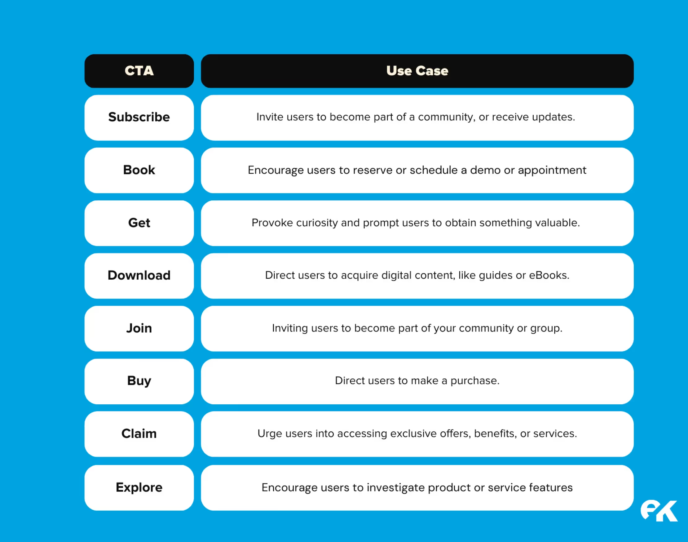
Different industries need different CTAs. For instance:
But across the board, the best CTAs tend to follow a few golden rules:
✅ Clear and concise
✅ Benefit-driven
✅ Visually standout
✅ Strategically placed
✅ Emotionally compelling
Let’s break that down with some real-life examples:
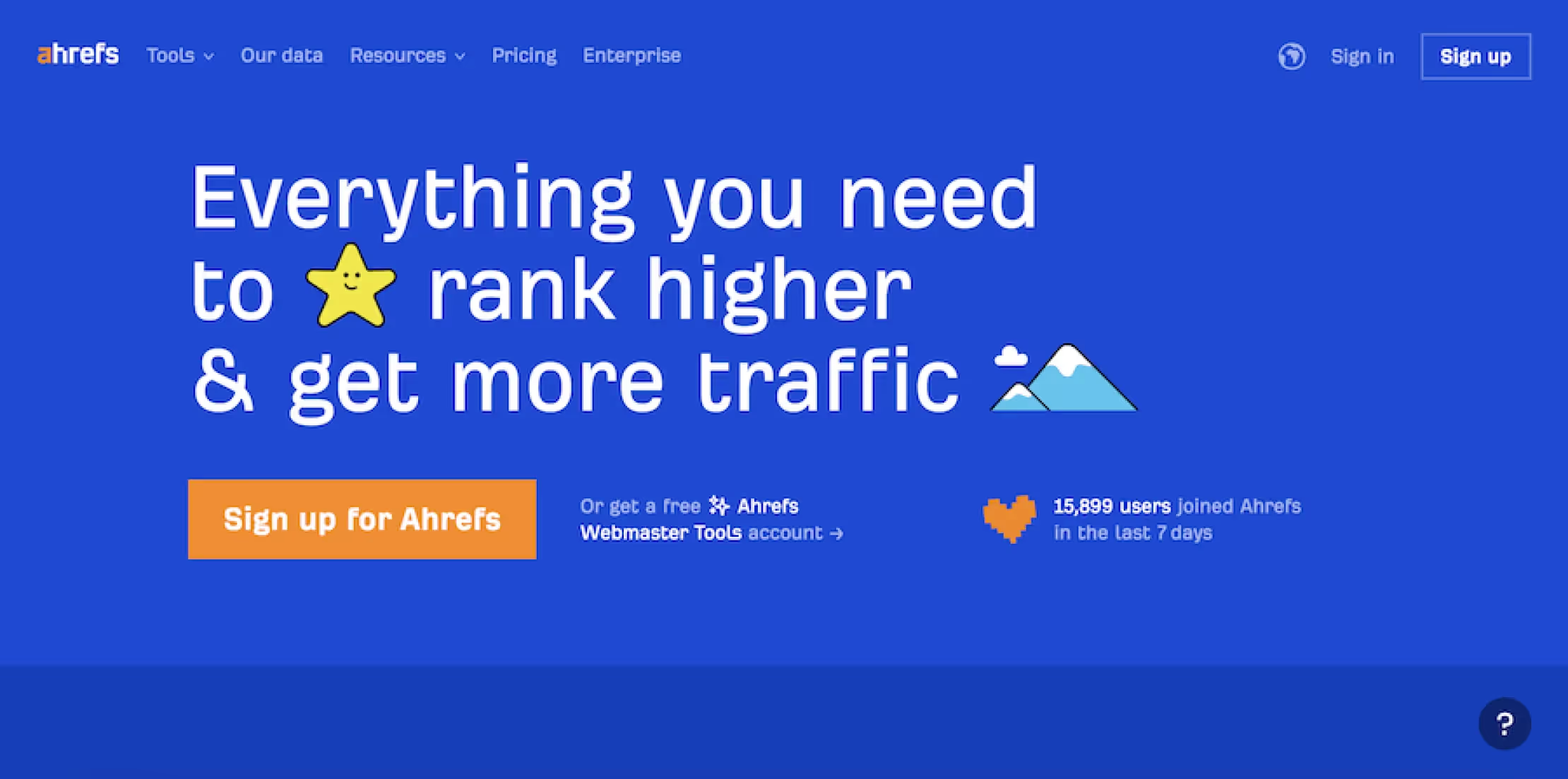
Ahrefs nails it with a simple, no-fluff CTA: “Sign up for Ahrefs.” Surrounding the button is a value-packed message: “Everything you need to rank higher & get more traffic.” Combined with social proof (like how many people signed up this week), it becomes an irresistible invitation.
Takeaway: Clear beats clever. Tell people exactly what they’ll get and what to do.
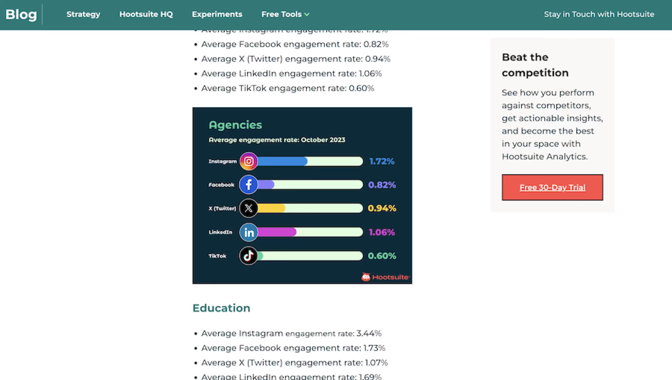
Hootsuite places its “Start Free Trial” CTA in a sticky sidebar — it stays visible as you scroll through the content. That smart placement means users never have to hunt for the next step. It’s right there, ready when they are.
Takeaway: Don’t hide your CTAs. Keep them in sight, especially during key decision-making moments.
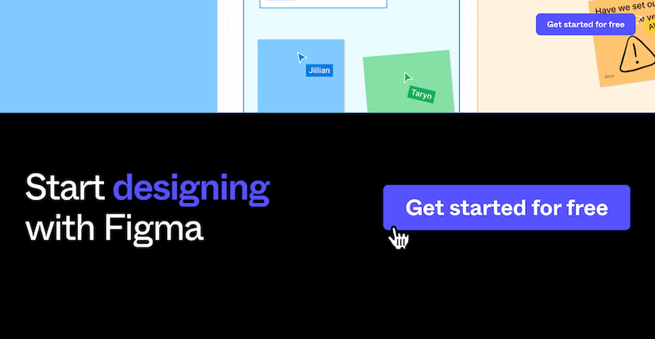
Figma uses vibrant colours, bold typography, and playful visuals to make their CTAs pop. The button “Get Started for Free” is clear, welcoming, and mirrors the fun, collaborative feel of the platform.
Takeaway: Your CTA should reflect your brand’s tone and visually stand out from the rest of the page.
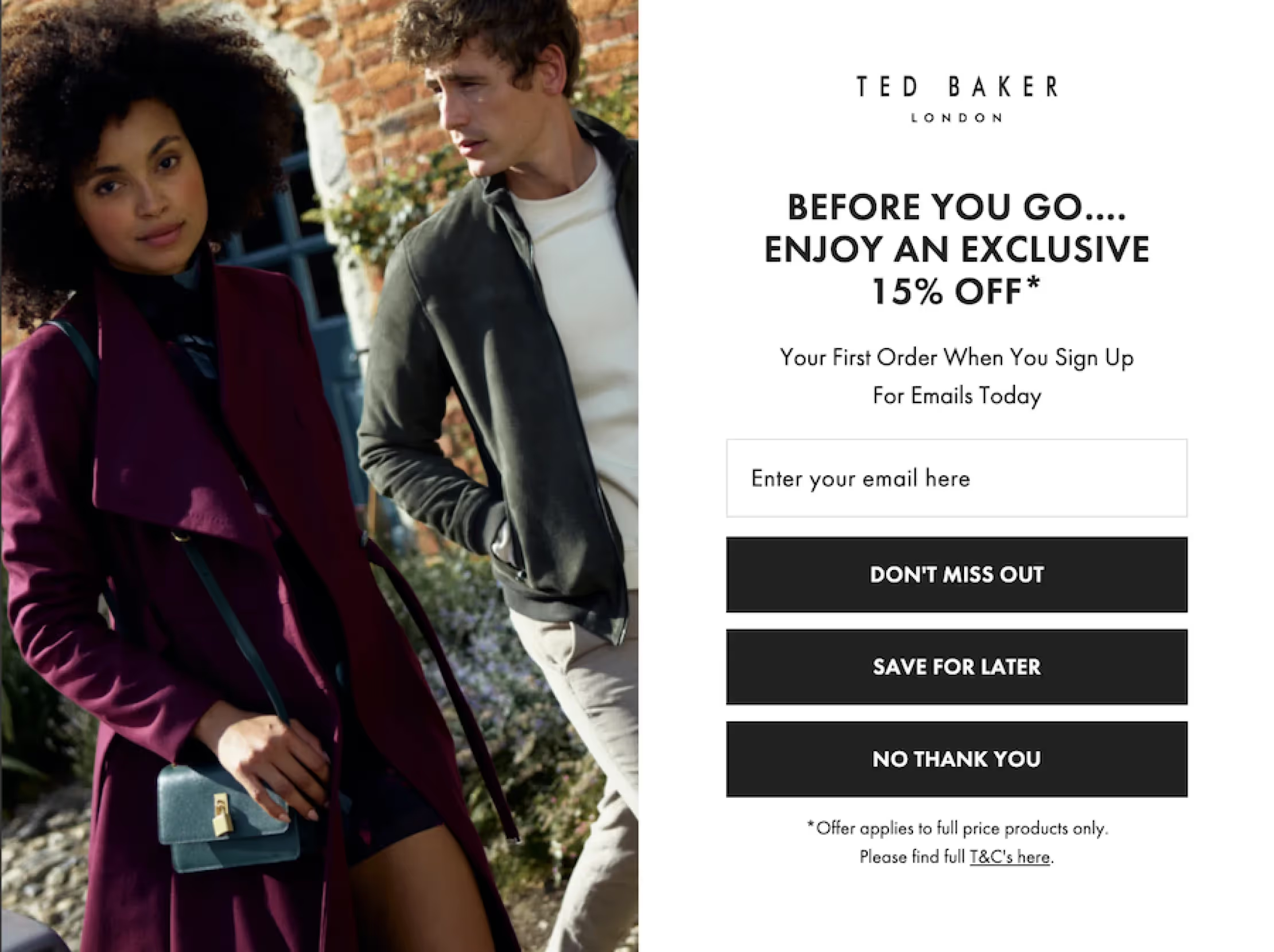
Ever seen a popup offering a limited-time discount? That’s exactly what Ted Baker uses: a 15% off incentive in exchange for your email, with an urgent CTA like “Don’t Miss Out.” This kind of time-sensitive language taps into FOMO (Fear of Missing Out), nudging users to act now instead of later.
Takeaway: Add urgency and exclusivity to drive faster decisions — especially in eCommerce.
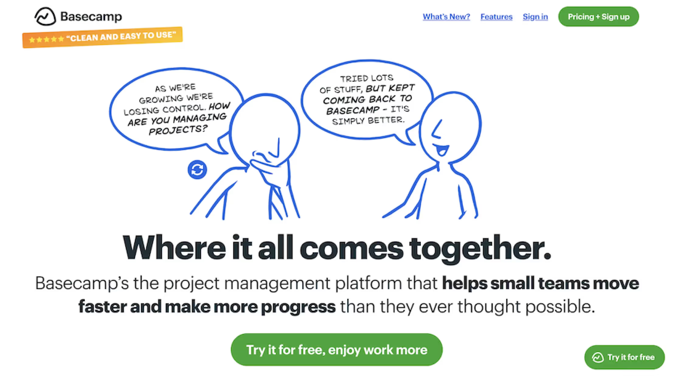
Basecamp doesn’t just ask users to “Try it for free.” They back it up with benefit-rich messaging: “Where it all comes together” and “Helps small teams move faster and make more progress.” This paints a picture of the outcome — better collaboration, less chaos.
Takeaway: Highlight what your audience gets, not just what they do. Make the benefit clear.
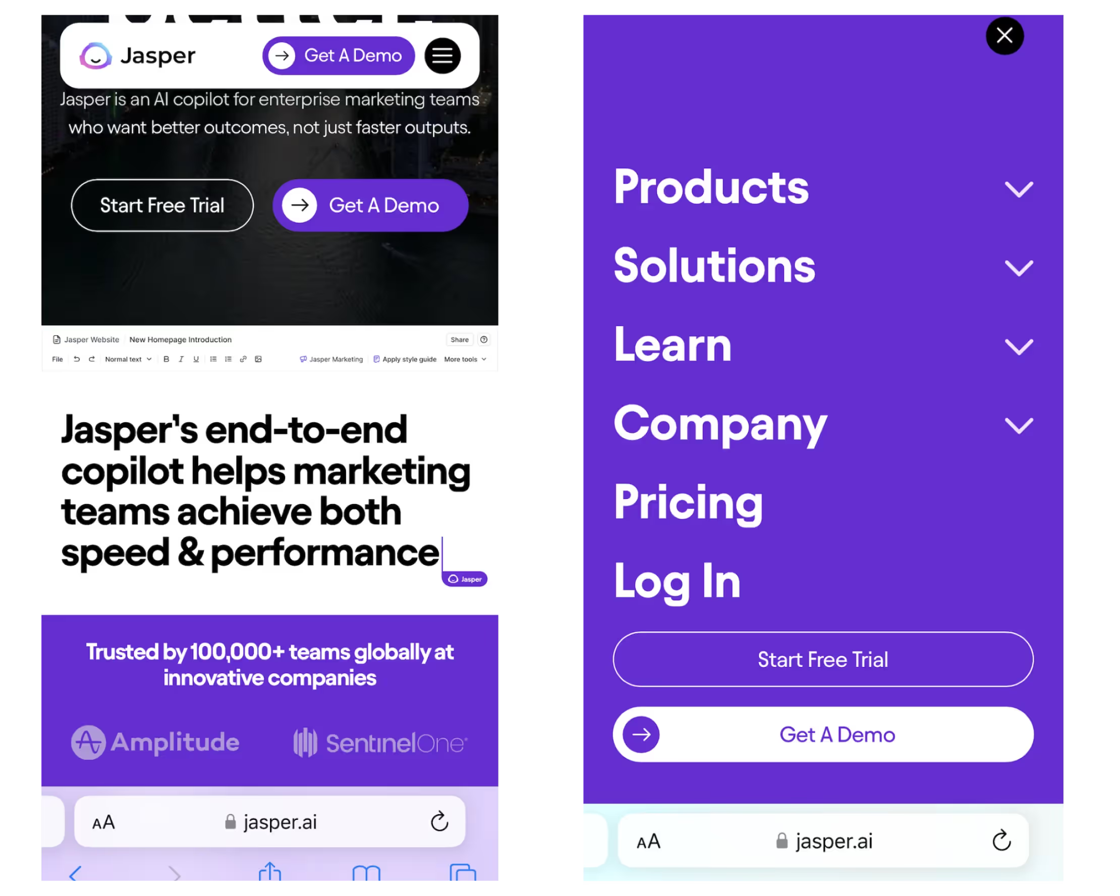
On mobile, Jasper.ai simplifies the CTA experience with options like “Start Free Trial” or “Get a Demo” prominently displayed. Their menus are clean, intuitive, and conversion-focused.
Takeaway: A great CTA experience needs to work on all devices. Make it easy for mobile users to take action — with minimal taps.


